
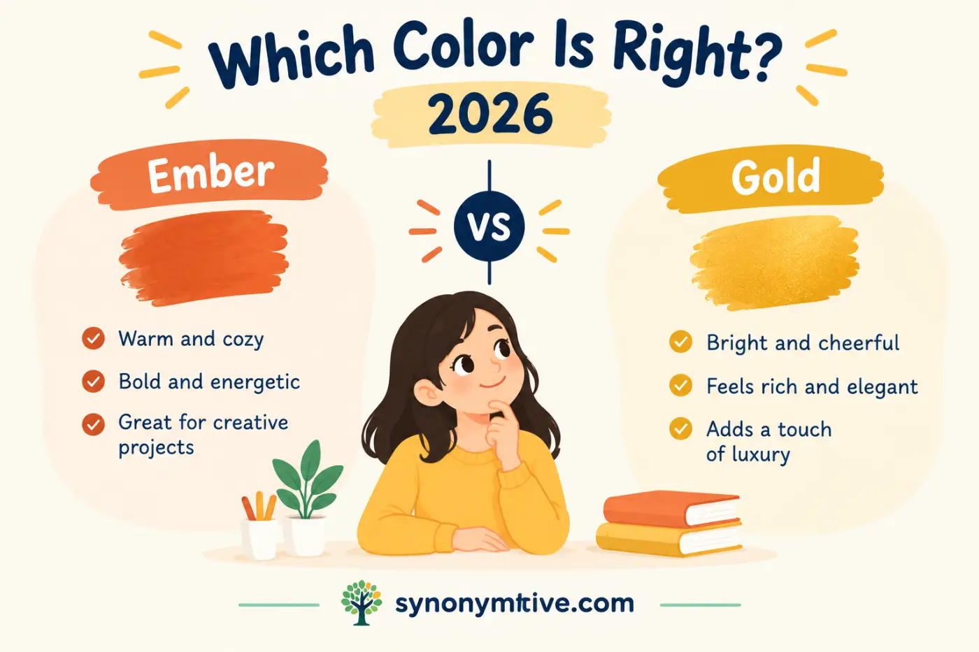
If you are comparing ember vs gold, the main difference is simple. Ember is a warm red or orange shade that suggests glowing fire, while gold is a warm yellow shade linked to sunlight, metal, and richness. The two colors can look warm and bright, but they create very different moods.
The confusion often comes from how flexible color names can be. Ember does not have one fixed shade across every brand, paint line, design system, or product. Gold also appears in many versions, from soft champagne gold to deep metallic gold. That makes the names easy to compare but harder to define by one exact color value.
This guide explains the difference between ember and gold, how each color looks, what each one means, and where you might use it. You will also see examples, color combinations, common mistakes, and simple ways to remember the difference.
Quick Definition
Ember is a warm color inspired by the red, orange, and glowing tones of a burning ember. It usually sits closer to red or orange than yellow.
Gold is a warm yellow color inspired by the appearance of the precious metal. It often has yellow, orange, brown, or metallic qualities depending on the shade.
Direct Answer
Ember is generally a glowing red or orange color, while gold is generally a rich yellow color. Choose ember for a warmer fiery look and gold for a brighter, richer, or more elegant look.
Comparison Table
| Word or Phrase | Meaning | Example Sentence | When to Use It |
|---|---|---|---|
| Ember | A warm red, orange, or reddish orange color inspired by glowing coals. | The logo uses a deep ember shade. | Use it for warmth, fire, autumn, or bold visual designs. |
| Gold | A warm yellow color associated with the precious metal. | The invitation has gold lettering. | Use it for luxury, celebration, value, or brightness. |
What Is Ember As A Color
Ember gets its color name from the glowing remains of a fire. Think about a piece of wood that has burned down but still shines with heat. Its surface can show red, orange, deep orange, and even dark brown tones.
Because of this natural source, ember usually looks warm and intense. It can be soft and muted, or it can be strong and bright. The exact shade depends on the color system or product using the name.
An ember shade often sits between red and orange. Some versions lean strongly toward orange. Others have more red and look closer to burnt red or deep rust.
The name also gives the color an emotional quality. Fire suggests warmth, strength, heat, movement, and life. That makes ember a popular choice for designs that need a strong warm presence.
What Ember Looks Like
Imagine the glowing center of a campfire after the flames have died down. You might see dark red edges, bright orange areas, and small spots of yellow. Ember takes inspiration from these warm fire colors.
A light ember shade can look like warm orange. A darker ember shade can resemble burnt red. Some versions can even look similar to terracotta or rust.
This range explains why two products called ember may not look exactly alike. Color names are often descriptive rather than universal.
Ember And Fire Colors
Ember belongs to the larger family of fire inspired colors. These include flame orange, burnt orange, scarlet, rust, copper, and deep red.
Still, ember has its own visual idea. Flame colors often suggest active fire. Ember suggests the glowing heat that remains after the flames become smaller.
That distinction can affect the mood of a design. A bright orange can look energetic and playful. A darker ember can look mature, warm, and dramatic.
What Is Gold As A Color
Gold is a yellow based color inspired by the precious metal. It usually combines yellow with warm orange or brown tones.
Unlike plain yellow, gold often has a richer and deeper appearance. Metallic gold can also reflect light, which gives it a shine that flat colors cannot fully reproduce.
The word gold carries strong associations with wealth, achievement, celebration, quality, and importance. That is why it appears often in awards, jewelry, formal invitations, logos, packaging, and decorative designs.
Gold can also be soft. Pale gold may look close to cream or champagne. Deep gold may look closer to mustard, bronze, or ochre.
What Gold Looks Like
Picture a gold ring under warm light. The metal may show yellow, orange, brown, and bright reflective areas. A digital gold color tries to capture some part of that appearance.
Not every gold color is metallic. Designers often use a flat golden yellow and still call it gold. Metallic gold usually needs gradients, highlights, or reflective material to create a convincing metal effect.
That is why the word gold can describe both a color and a material.
Gold And Yellow
Gold is related to yellow, but the two colors are not always interchangeable.
Yellow is usually brighter and cleaner. Gold tends to look deeper, warmer, or more muted. Metallic gold adds another difference because it can have a reflective surface.
For example, a bright yellow shirt may look cheerful and casual. A deep golden fabric can look richer and more formal.
The Main Difference Between Ember And Gold
The clearest difference is their position within the warm color family.
Ember generally leans toward red and orange. Gold generally leans toward yellow and yellow orange.
That difference affects how the colors behave next to other shades. Ember creates stronger contrast with cool colors such as blue and teal. Gold can also contrast with blue, but it often creates a softer and more classic pairing.
Ember usually looks more fiery. Gold usually looks more radiant and refined.
The two colors can also work together. Ember can provide depth and warmth, while gold can add brightness and emphasis. This pairing often creates a rich autumn or luxury style.
Ember Vs Gold In Color Theory
Color theory gives you another way to understand the difference.
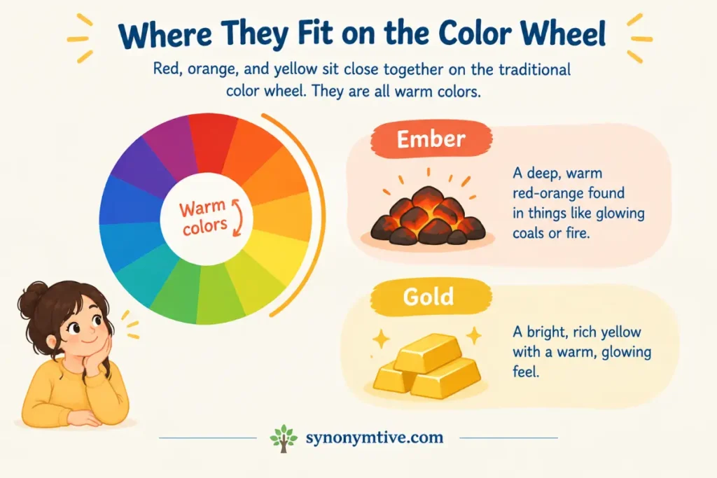
Red, orange, and yellow sit close together on the traditional color wheel. They are all warm colors. Ember and gold belong to this same warm side, but they occupy different areas within it.
Ember generally moves toward red and orange. Gold moves toward yellow and orange.
Because they are close on the color wheel, the two colors can work well together. They share warmth instead of fighting for attention.
Still, they do not create the same visual effect.
A deep ember color can become the dominant color in a design. Gold can work better as an accent when you want small areas to stand out.
Ember On A Color Wheel
Ember is not one standardized point on every color wheel. Its exact location depends on the shade.
A reddish ember may sit closer to red. An orange ember may sit closer to orange. A muted ember may have brown or gray mixed into it.
The common feature is warmth and a connection to glowing fire.
Gold On A Color Wheel
Gold also has no single universal location on every color wheel. Most golden shades sit between yellow and orange.
A bright gold may appear close to yellow. A deep gold can move toward orange or brown.
Metallic gold adds another visual property that traditional color wheels do not fully represent. Shine and reflection can change how the color appears under different lighting.
Ember And Gold In Design
Designers often choose colors based on the mood they create rather than their names alone.
Ember can make a design look warm, bold, earthy, dramatic, or energetic. It can work well for autumn themes, food brands, outdoor products, sports designs, and strong visual identities.
Gold can make a design look elegant, valuable, festive, traditional, or luxurious. It works well for awards, weddings, premium packaging, formal events, and decorative details.
The surrounding colors matter too. An ember shade beside cream may look soft and cozy. The same shade beside black can look much stronger.
Gold beside white can look clean and bright. Gold beside black can look dramatic and luxurious.
When To Choose Ember
Choose ember when you want warmth with a stronger red or orange character.
It works especially well when the subject involves fire, autumn, heat, cooking, adventure, nature, or strong emotion.
For example, a restaurant brand might use ember to create a warm and inviting appearance. A camping company might use it to suggest firelight and outdoor evenings.
Ember can also work well as a background color when you want a design to have a rich warm base.
When To Choose Gold
Choose gold when you want a color that suggests value, celebration, achievement, or elegance.
Gold is a natural choice for awards and special events. It also works well for jewelry brands, premium products, formal invitations, and decorative elements.
You can use a small amount of gold to draw attention to important details. Gold text, borders, icons, and symbols can stand out against darker backgrounds.
Ember Vs Gold In Clothing
Color names become especially flexible in clothing. A retailer may describe one orange red garment as ember, while another may use the same name for a darker shade.
An ember shirt can give an outfit a warm and bold appearance. It often pairs well with cream, beige, brown, navy, denim, black, and other earthy shades.
Gold clothing usually has a brighter and more decorative appearance. A soft gold dress can look elegant, while a strong metallic gold garment can look dramatic.
Gold also works well as a small accent. Shoes, jewelry, belts, buttons, or accessories can add a golden detail without making the whole outfit bright.
Ember Clothing Examples
An ember sweater can create a cozy fall look. Pairing it with dark jeans and brown shoes can keep the outfit grounded.
An ember jacket can stand out against neutral clothing. Black, cream, gray, and denim can all provide a simple background.
An ember dress can also work for evening events. A darker version may look more formal than a bright orange shade.
Gold Clothing Examples
A gold blouse can add warmth to a simple outfit. Black trousers can create a strong contrast.
Gold accessories can add a decorative touch to neutral clothing. A gold watch, necklace, or handbag can stand out without taking over the outfit.
Metallic gold is often stronger than flat gold. Use it carefully if you want a softer appearance.
Ember Vs Gold In Home Decor
Both colors can make a room warmer, but they do it in different ways.
Ember works well for walls, cushions, blankets, rugs, artwork, and other larger areas. A deep ember shade can make a room look cozy and dramatic.
Gold often works best as an accent. You might see it in lamps, frames, handles, mirrors, hardware, or decorative objects.
A room with too much strong gold can look busy. A room with too much deep ember can feel visually heavy. Balance matters.
Using Ember At Home
Use ember with natural materials such as wood, leather, stone, and woven fabrics. These materials support its earthy warmth.
Cream and beige can soften the strength of ember. Navy and dark green can create a deeper and more dramatic combination.
For an autumn inspired room, ember can work with brown, rust, mustard, and warm cream.
Using Gold At Home
Gold pairs naturally with black, white, cream, navy, green, and many deep jewel tones.
Brushed gold often looks softer than highly polished metallic gold. It can work well on cabinet handles, lighting fixtures, mirrors, and small decorative pieces.
You do not need much gold to make it noticeable. A few small details can provide enough contrast.
Ember And Gold Together
These colors can make a strong pair because they share a warm base.
Ember brings depth. Gold brings brightness.
Imagine a dark ember background with thin gold lettering. The gold becomes the focal point because it stands against the deeper warm shade.
Another option is an ember dress with gold jewelry. The red orange color provides the main visual field, while gold adds small areas of brightness.
The combination can also work in invitations, branding, seasonal graphics, packaging, and interior decoration.
Why The Pair Works
The colors are related but not identical. Ember usually carries more red and orange. Gold carries more yellow.
That gives them enough similarity to look connected and enough difference to remain visible.
The result can be warm and rich without requiring many colors.
Best Neutral Colors With Both
Cream is one of the easiest neutrals to use with ember and gold. It softens the warm colors and keeps the overall design light.
Black creates a much stronger effect. Gold can look especially bright against black, while ember can become deeper and more dramatic.
Brown supports the earthy side of ember. It can also make gold look warmer.
White creates a cleaner contrast. It works especially well when you want the design to look bright rather than heavy.
How Ember And Gold Affect Mood
Color can influence the impression a design gives. It does not create one fixed emotional response for every person, but common color associations can guide design choices.
Ember often suggests heat, warmth, fire, strength, movement, and comfort. Its connection to glowing coals gives it a natural sense of warmth.
Gold often suggests value, success, celebration, wealth, quality, and importance. Its connection to precious metal gives the color a strong cultural association with status and achievement.
These meanings can change based on context.
A bright ember logo may look energetic. A muted ember wall may look calm and cozy.
A gold trophy suggests achievement. A soft gold wedding invitation may suggest elegance.
Common Mistakes With Ember And Gold
Color names can cause several mistakes, especially when people expect every name to represent one exact shade.
Assuming Ember Has One Exact Color
Ember is a descriptive color name rather than one universal color standard.
One brand may use a reddish orange ember. Another may use a deeper red. A third may use a muted burnt orange.
Always check the actual color sample if an exact match matters.
Assuming Gold Means Metallic Gold
Gold can describe a flat yellow gold color or a reflective metallic material.
A digital color swatch may look golden but have no metallic effect. Metallic gold usually needs changes in light, reflection, or texture.
Do not expect a single color code to create the same appearance as real gold metal.
Treating Ember And Orange As The Same
Ember can be orange, but it is usually more specific in mood and depth.
A basic orange may look brighter and cleaner. Ember often has a darker, warmer, or more fire inspired quality.
The exact difference depends on the shade being used.
Treating Gold And Yellow As The Same
Gold belongs to the yellow family, but it often has more depth and warmth.
A clean lemon yellow can look fresh and bright. A golden yellow can look warmer and richer.
Metallic gold adds another layer through reflection.
Choosing A Color From The Name Alone
A color name is not enough when accuracy matters.
Look at the swatch. Check the lighting. Compare the color with the surrounding materials.
This matters most for clothing, paint, printing, branding, and home decor.
Examples Of Ember In Sentences
The examples below show how ember can describe a color or create a visual association.
- The designer chose an ember background for the autumn campaign.
- She wore an ember sweater with dark jeans.
- The room had ember colored cushions beside a cream sofa.
- The logo uses a deep ember shade to suggest warmth.
- The sunset gave the clouds an ember glow.
- The artist used ember tones to paint the dying fire.
- An ember scarf added a warm accent to the neutral outfit.
- The restaurant used ember red in its menu design.
- The walls were painted a muted ember shade.
- Gold lettering stood out against the dark ember background.
These examples show why ember is closely tied to warmth and fire. The word can work as a straightforward color description or as a visual image.
Examples Of Gold In Sentences
Gold can describe a color, a material, or something valuable.
- The invitation has gold lettering on a dark background.
- She chose a soft gold dress for the evening event.
- The designer added gold details to the package.
- The trophy has a bright gold finish.
- Gold accents made the room look more formal.
- The artist used warm gold tones in the painting.
- The necklace has a polished gold surface.
- The logo uses gold to suggest quality and success.
- A thin gold border surrounds the card.
- The sunlight gave the leaves a soft gold appearance.
These examples show the wider use of gold. The word can refer to a color or to actual metal.
How To Choose Between Ember Vs Gold
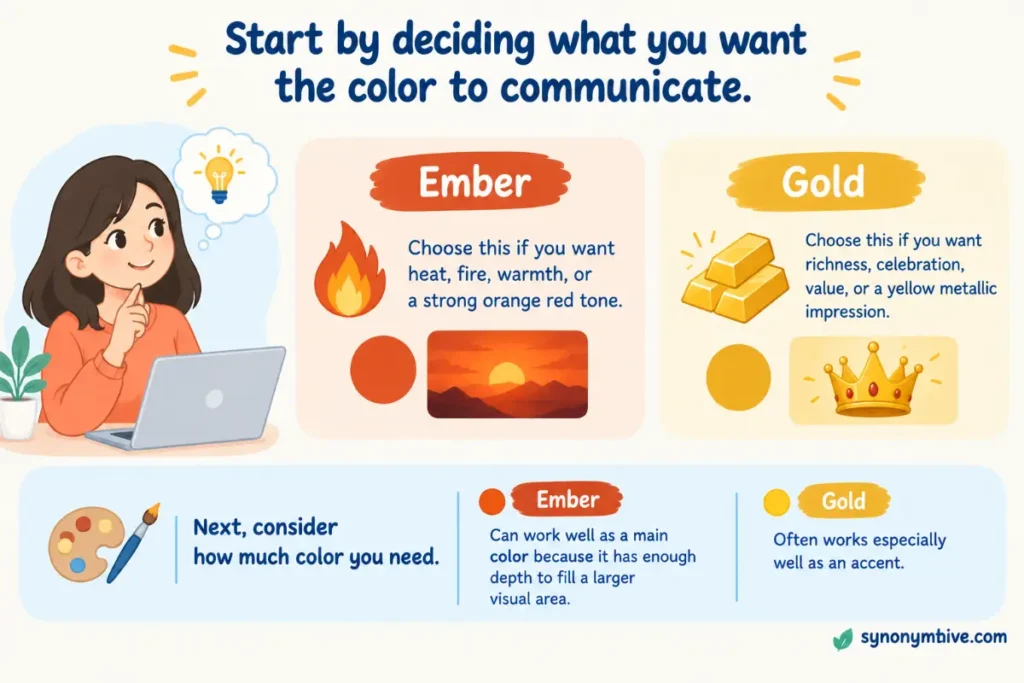
Start by deciding what you want the color to communicate.
If you want heat, fire, warmth, or a strong orange red tone, ember is usually the better choice.
If you want richness, celebration, value, or a yellow metallic impression, gold is usually the better choice.
Next, consider how much color you need. Ember can work well as a main color because it has enough depth to fill a larger visual area. Gold often works especially well as an accent.
Then look at the colors around it. A color that looks perfect by itself can look different beside black, white, blue, green, cream, or brown.
Finally, compare actual swatches. Names help you understand the general idea, but the sample tells you what the color will really look like.
Ember And Gold For Branding
Brand colors need to communicate quickly. Ember and gold can both create strong identities, but they send different signals.
An ember based brand can appear warm, bold, active, earthy, or passionate. It may suit restaurants, outdoor companies, sports brands, food products, and businesses connected with heat or craftsmanship.
A gold based brand can suggest quality, achievement, premium products, celebration, or tradition. It may work well for jewelry, luxury goods, events, awards, finance, or high end services.
The surrounding palette matters just as much as the main color.
An ember logo with cream and brown can look natural. The same ember logo with black can look bold.
A gold logo with white can look clean. Gold with black can look formal and dramatic.
Ember And Gold For Digital Design
Screens display color through light, so digital versions can look different from printed materials.
A gold color on a screen may look flat unless the design uses highlights or gradients. A real metallic gold surface reflects its surroundings, but a screen color cannot reproduce that effect with one flat value.
Ember is usually easier to represent as a flat digital color. Its identity mainly comes from hue, brightness, and saturation.
When designing for websites or apps, check the contrast between text and its background. A beautiful color is not useful if readers cannot clearly see the words.
This is especially important for accessibility. Dark ember text may work well on a light cream background, while gold text can become difficult to read on white.
Ember And Gold For Print
Printing introduces another layer of color difference.
Ink does not behave exactly like light on a screen. Paper texture, ink type, coating, and printing method can change the final appearance.
A flat golden yellow can print easily, but a true metallic gold often requires special ink or finishing.
Ember can also shift during printing. A bright orange red may become darker or less vivid on certain paper.
For important print work, always review a physical proof when possible.
Related Colors To Know
Understanding nearby colors makes the ember and gold comparison easier.
Burnt Orange
Burnt orange is a darker orange with brown or muted qualities. It often looks earthy and autumnal.
Some ember shades can look very close to burnt orange.
Rust
Rust is a reddish orange or brown orange color inspired by oxidized iron. It is usually more earthy and muted than bright ember.
Copper
Copper sits between orange, red, and brown. It is also associated with metal, much like gold.
Copper can look darker and more orange than many golden shades.
Mustard
Mustard is a muted yellow with brown or green qualities. It is usually less bright than pure yellow.
Some deep gold shades can resemble mustard, but gold often has a richer yellow or metallic association.
Bronze
Bronze is a brownish metallic color with orange and gold qualities. It is usually darker than gold.
Amber
Amber is a warm yellow orange color. It can sit visually between orange and gold.
This is one reason amber and ember are sometimes confused. The names sound similar, but they can refer to different colors.
Ember And Amber
Ember and amber deserve special attention because the words look and sound similar.
Ember refers to a glowing piece of coal or wood left after a fire. As a color, it usually suggests red or orange fire tones.
Amber refers to a fossilized tree resin and also to a warm yellow orange color. Amber usually leans closer to yellow than ember.
A simple memory trick is to connect ember with embers in a fire and amber with golden yellow resin.
The two colors can overlap in some shades, but their common color associations are different.
Gold And Bronze
Gold and bronze can also look similar, especially in darker designs.
Gold usually has a stronger yellow quality and a brighter association with value and luxury.
Bronze usually has more brown and orange. It often looks older, earthier, or darker.
If you want a bright precious metal appearance, gold is usually the clearer choice. If you want a deeper metallic appearance, bronze may fit better.
Gold And Copper
Gold and copper both have warm metallic qualities, but copper usually has more orange and red.
Copper can therefore sit visually closer to ember than gold does.
A palette using ember, copper, and gold can create a strong warm metal theme. The three colors can be separated by brightness and saturation.
Which Color Is Warmer
Both colors are warm, but ember often appears hotter because of its connection to fire.
Gold can also look very warm, especially when it has strong orange or brown tones.
The exact answer depends on the shades being compared. A bright golden yellow can appear warmer than a muted reddish ember.
That is why color names should not replace visual comparison.
Which Color Is Brighter
Gold is often brighter than ember, especially when the gold shade is a strong yellow.
Ember usually has more depth because it tends to include red, orange, brown, or darker tones.
Still, a light ember shade can be brighter than a deep gold shade. Brightness depends on the actual color value rather than the name.
Which Color Looks More Elegant
Gold usually has the stronger association with elegance and luxury.
That connection comes from gold metal, jewelry, awards, formal decoration, and cultural ideas about value.
Ember can also look sophisticated, especially when it is dark and muted. Its strength usually comes from warmth and richness rather than luxury.
For a formal invitation, gold may be the safer choice. For a warm and dramatic brand, ember may have more impact.
Which Color Is Better For Fall
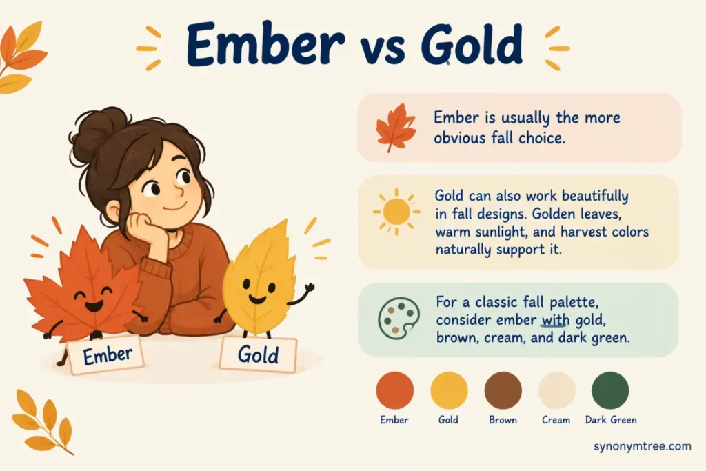
Ember is usually the more obvious fall choice.
Its connection to fire, leaves, warm light, and earthy colors fits common autumn palettes.
Gold can also work beautifully in fall designs. Golden leaves, warm sunlight, and harvest colors naturally support it.
For a classic fall palette, consider ember with gold, brown, cream, and dark green.
A Simple Memory Trick
Remember the source of each color.
Ember means fire.
Think of glowing coals after a fire. That points you toward red and orange.
Gold means metal.
Think of a gold ring or medal. That points you toward rich yellow.
If you remember the object behind each name, the color difference becomes much easier.
Conclusion
The simplest way to understand ember vs gold is to remember their sources. Ember comes from the glowing remains of a fire, so it usually sits in the red and orange range. Gold comes from the precious metal, so it usually sits in the yellow range and often carries a richer or more polished appearance.
Ember works well when you want warmth, fire, depth, or a bold earthy tone. Gold works well when you want brightness, value, celebration, or elegance. Neither color has one exact appearance across every product or design system, so always check the actual color sample when accuracy matters.
For a quick choice, think fire means ember and metal means gold. If the color should look hot and glowing, start with ember. If it should look rich and radiant, start with gold.
Frequently Asked Color Questions
Is ember red or orange?
Ember can be red, orange, or a mix of both. Most ember shades sit somewhere between red and orange and have a warm fire inspired appearance.
Is gold yellow or orange?
Gold is mainly associated with yellow, but many gold shades contain orange or brown tones. The exact appearance depends on the shade and material.
Is ember darker than gold?
Ember often looks darker than bright gold because many ember shades contain deep red or orange tones. However, a light ember can be brighter than a dark gold.
Is ember the same as burnt orange?
No. Ember and burnt orange can look similar, but ember is a broader fire inspired color name. Burnt orange usually refers to a darker and more muted orange with brown tones.
Is gold the same as mustard?
No. Gold and mustard are both yellow based colors, but mustard is usually more muted and brown or green toned. Gold often has a richer yellow appearance and may have a metallic association.
Can ember and gold be used together?
Yes. Ember and gold can work very well together because both are warm colors. Ember can provide the deeper base while gold adds brightness and emphasis.
Is ember a standard color?
No single ember shade is used everywhere. Different brands and color systems can use the name for different red orange shades.
Is gold always metallic?
No. Gold can describe a flat color as well as a metallic material. A digital gold swatch may look golden without having a reflective metallic surface.
